Kywal Qya
BRANDING & PACKAGING DESIGN
Branding
Packaging
Co-design
LOGO ALTERNATIVES
PACKAGING
Brand:
Kyawal Qya
Kyawal Qya is an agricultural products cooperative, offering vegetables, dairy products and agroecological fertilizers. Its production is carried out by entrepreneurial women with agroecological processes that seek to expand and diversify their product catalogue.
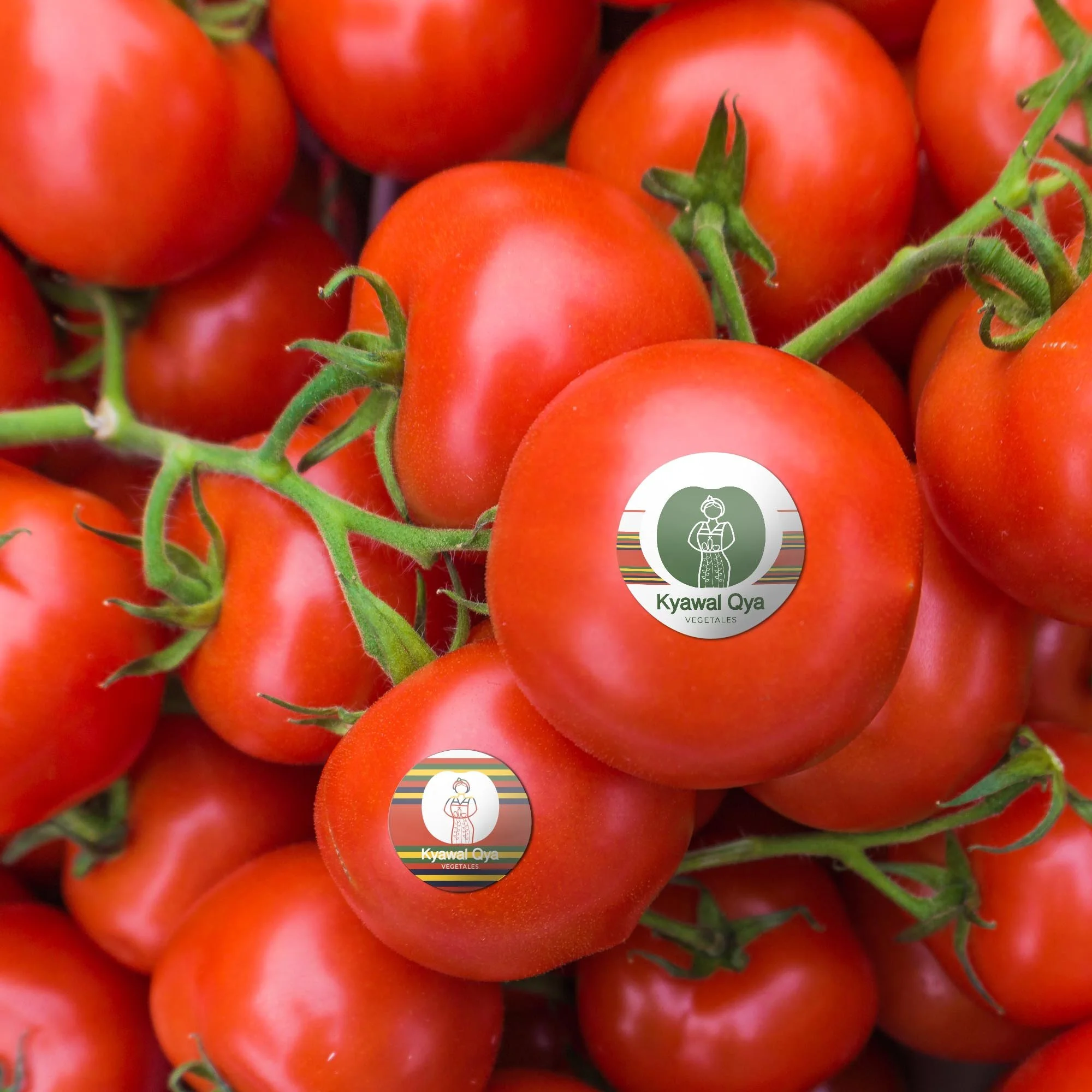
Kyawal Qya means “woman's harvest” in Mayan Mam since the production process is carried out by Mam Indigenous women. The image has the shape of a tomato (this being its most emblematic product) with a silhouette of a woman with vegetables in her arms, representing the work of each woman in this production process.
Kyawa Qya seeks to create a brand that encompasses the different categories of products that the cooperative offers or may offer. In this way, Kyawal Qya is the umbrella brand of each of these categories using the main logo with colour and text adjustments.
Develop into the context of the Awal Q’anil project managed by We Effect and funded by The European Union.
GRAPHIC ELEMENTS
EXPLORE MORE -


